After playing with the new In Colors for over a month I wanted to share my Best In Color Combinations (2025 Edition). In this post I'll share the colors I think work great with each new color if you're looking for a monochromatic look or similar colors. I will also share a PDF resource with color combinations
The Combinations
We have five new brilliant colors to work with this year. Now I don't mean brilliant in terms of the colors themselves, but they are a brilliant, as in super smart, addition to the other 45 colors. You'll find these really fill the gaps where they are needed. Let me know if you think these are a great addition.
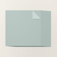
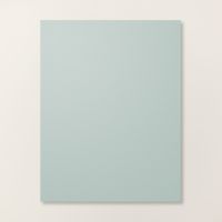
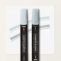
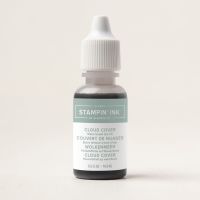
Cloud Cover

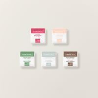
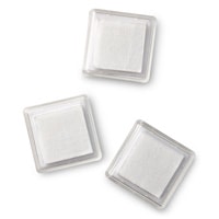
I was super excited for this color – I love that it's yet another gray with a much more blue tone. The card stock is gorgeous as are the Stampin' Blend pens and markers. Unfortunately, we might not get an ink pad in this color. BUT you have a great alternative. You can purchase a package of empty Stampin' Spots and the refill bottle. Then you can make your own whenever you'd like. Alternatively, Stampin' Up! has already made a Cloud Cover Stampin' Spot for you to use – it's in a set with some other great colors. You'll find all these products pictured below. Hope this helps you enjoy this color.
When I took a closer look at Cloud Cover in the current Stampin’ Up! color collection, two colors jumped out as perfect companions—Pool Party and Smoky Slate. Pool Party highlights the soft blue tones in Cloud Cover, while Smoky Slate brings out the subtle grays. It’s such a versatile shade, and honestly, that’s why I love it! Cloud Cover fills a color gap we didn’t even realize we were missing.

Darling Duckling

We can always use a fresh twist on a primary color, and this year’s new yellow—Darling Duckling—is just that! It’s a bit muddier than the other yellows in the Stampin’ Up! color palette, and that’s what makes it so useful. Unlike some of the brighter yellows, Darling Duckling doesn’t compete for attention when you’re working with lots of colors on one card. It adds warmth without overwhelming your design—such a handy shade to have on hand!
Crushed Curry and Daffodil Delight are the closest yellows to Darling Duckling. Of course Stampin' Up! has Lemon Lolly and Lemon Lime which also compliment Darling Duckling. Give them all a try and let me know what you like best.

Sea Secret

When I first looked at the new color palette, I completely glossed over this one. But once I got the ink pad in my hands and started playing with it—wow! It quickly shot to the top of my favorites list. Why? Because it’s such a deep, rich blue that you can easily use it in place of black. That opens up a whole new creative world! You get the smooth, high-quality formula of a Stampin’ Up! ink on a foam pad—perfectly inky, deeply pigmented, and super dark. Don’t get me wrong—I still like the Memento Tuxedo Black pad, but since it's a felt pad and the ink soaks in quickly, I find myself re-inking it almost every time I use it. This new dark blue is such a welcome alternative!
The complimenting colors for Sea Secret are Night of Navy and Misty Moonlight. They are the other “dark” blues, but as you can see – Sea Secret is the darkest blue.

Strawberry Slush

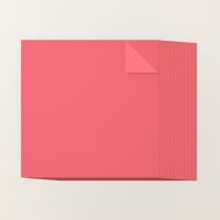
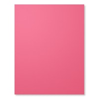
If you’ve been around Stampin’ Up! for a while, you’ll probably recognize this color—it’s back, and I’m so excited! I loved using it before, and I’m thrilled to have it in my collection again. It even makes me miss Strawberry Sorbet a little less! While this shade is definitely more pink than Strawberry Sorbet, it fills that red-pink gap in the color palette beautifully.
The complimenting colors for Strawberry Slush are Flirty Flamingo and Pretty in Pink. These will work great this year, but I'm curious to see what will happen when Pretty In Pink retires in Spring 2026.

Timid Tiger

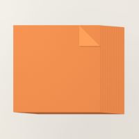
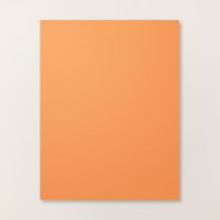
I think the name says it all—Timid Tiger looks like a soft, muted orange. Now stay with me here, because I really think this is a great addition to the Stampin’ Up! color palette. We’ve had Pumpkin Pie for a long time, and over the years, Stampin’ Up! has introduced a few other bright oranges—but they never stuck around. And honestly, that makes sense. You don’t really need multiple bright oranges.
But Timid Tiger is different. It’s more subdued, and that muted tone fills a gap we’ve always had. I’m loving it right now, and I already know I’ll be sad to see it go when it retires in spring 2027.
This picture says it all. Do you see how nicely Timid Tiger fits into the new color pallet. This is why I'm so excited to use this as much as possible in the coming months.

Thanks for Stopping By
I really appreciate you reading all the way to the end of the blog post. I'm thinking about making these color combinations for the upcoming holidays too. Would you like a color recommendations for Fall, Halloween and Christmas? Leave a comment and let me know. xo, Linda



![2025–2027 In Color™ Stampin' Write Markers [ 165292 ] 2025–2027 In Color™ Stampin' Write Markers [ 165292 ]](https://assets1.tamsnetwork.com/images/EC042017NF/165292s.jpg)
![Darling Duckling Stampin’ Blends Combo Pack [ 165288 ] Darling Duckling Stampin’ Blends Combo Pack [ 165288 ]](https://assets1.tamsnetwork.com/images/EC042017NF/165288s.jpg)
![Darling Duckling Classic Stampin' Ink Refill [ 165280 ] Darling Duckling Classic Stampin' Ink Refill [ 165280 ]](https://assets1.tamsnetwork.com/images/EC042017NF/165280s.jpg)
![Darling Duckling Classic Stampin' Pad [ 165277 ] Darling Duckling Classic Stampin' Pad [ 165277 ]](https://assets1.tamsnetwork.com/images/EC042017NF/165277s.jpg)

![Low Profile Dots [ 164658 ] Low Profile Dots [ 164658 ]](https://assets1.tamsnetwork.com/images/EC042017NF/164658s.jpg)
![Classic Stampin' Spot Small Assortment 2 [ 166717 ] Classic Stampin' Spot Small Assortment 2 [ 166717 ]](https://assets1.tamsnetwork.com/images/EC042017NF/166717s.jpg)

![Secret Sea Stampin’ Blends Combo Pack [ 165289 ] Secret Sea Stampin’ Blends Combo Pack [ 165289 ]](https://assets1.tamsnetwork.com/images/EC042017NF/165289s.jpg)
![Secret Sea Classic Stampin' Pad [ 165285 ] Secret Sea Classic Stampin' Pad [ 165285 ]](https://assets1.tamsnetwork.com/images/EC042017NF/165285s.jpg)
![Secret Sea Classic Stampin' Ink Refill [ 165281 ] Secret Sea Classic Stampin' Ink Refill [ 165281 ]](https://assets1.tamsnetwork.com/images/EC042017NF/165281s.jpg)

![Strawberry Slush & Pretty In Pink Gems [ 165615 ] Strawberry Slush & Pretty In Pink Gems [ 165615 ]](https://assets1.tamsnetwork.com/images/EC042017NF/165615s.jpg)
![Strawberry Slush Stampin’ Blends Combo Pack [ 165290 ] Strawberry Slush Stampin’ Blends Combo Pack [ 165290 ]](https://assets1.tamsnetwork.com/images/EC042017NF/165290s.jpg)
![Strawberry Slush Classic Stampin' Pad [ 165286 ] Strawberry Slush Classic Stampin' Pad [ 165286 ]](https://assets1.tamsnetwork.com/images/EC042017NF/165286s.jpg)
![Strawberry Slush Classic Stampin' Ink Refill [ 165282 ] Strawberry Slush Classic Stampin' Ink Refill [ 165282 ]](https://assets1.tamsnetwork.com/images/EC042017NF/165282s.jpg)

![Pack Your Bags Twine Three Pack [ 165582 ] Pack Your Bags Twine Three Pack [ 165582 ]](https://assets1.tamsnetwork.com/images/EC042017NF/165582s.jpg)
![On The Go Puffy Stickers [ 165581 ] On The Go Puffy Stickers [ 165581 ]](https://assets1.tamsnetwork.com/images/EC042017NF/165581s.jpg)
![Timid Tiger Stampin’ Blends Combo Pack [ 165291 ] Timid Tiger Stampin’ Blends Combo Pack [ 165291 ]](https://assets1.tamsnetwork.com/images/EC042017NF/165291s.jpg)
![Timid Tiger Classic Stampin' Ink Refill [ 165283 ] Timid Tiger Classic Stampin' Ink Refill [ 165283 ]](https://assets1.tamsnetwork.com/images/EC042017NF/165283s.jpg)
![Timid Tiger Classic Stampin' Pad [ 165278 ] Timid Tiger Classic Stampin' Pad [ 165278 ]](https://assets1.tamsnetwork.com/images/EC042017NF/165278s.jpg)


Leave A Comment