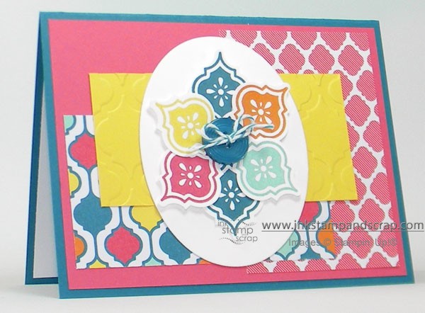
Playing with Stampin' Up! Designer Series Paper makes card making a breeze! I pulled out the beautiful Quatrefancy Designer Series Paper and just let that be my guide. All the mosaic shapes are in the same direction even though they are from different mediums. The colors for the card came from the bottom left layer of paper.
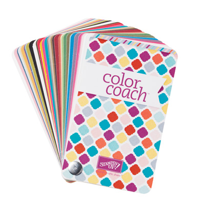
Color is an important factor when making a card. If you're not sure what to mix together Stampin' Up! papers can help you out. Another great color helper is our Color Coach. I took a look at that just to see what I might pair for the card once I chose Strawberry Slush for the base of the pieces of the card. The Color Coach had beautiful combinations, but nothing that worked with the colorful paper. What did I do? Back to the original source: that piece of paper in the lower left. I figured since I used an Island Indigo Button, Island Indigo Baker's Twine I should also use that as the card.
You can see just a little Whisper White Card Stock peeking out from the inside of the card. I find this a nice touch when using a darker color for the base of your card. Now this is all ready to write inside and and send to someone special!
I was cleaning up my stamping space yesterday and realized that posting as often as I do has created a LARGE collection of cards. Leave me a comment and let me know what you think I should do with them – sell them, donate them, send to friends and family?


I donate all my extra cards to Operation Write Home. This volunteer run organization sends handcrafted cards to deployed soldiers so that they have the opportunity to send beautiful cards to their loved ones while they are away. In case you are interested there website is http://operationwritehome.org/
Like your colorful card. For me I package up my cards and give to family. have no idea where to donate or sell so if you find out please let me know. thanks
stamping sue
http://stampingsueinconnecticut.blogspot.com/
Linda just wanted to say thank you for clearing up about getting around your new blog. like the big note with arrow. thank you
stamping sue
http://stampingsueinconnecticut.blogspot.com/